Interface Colors: Decoding Impact on Chinese Digital Shoppers
January 30th, 2024 · Written by Anna Kondrasheva
Contents
The subtle power of color has fascinated researchers and marketers for decades. Pioneering studies in the 20th century unlocked groundbreaking insights into how different hues can shape emotions, trust perceptions, and even behavioral responses. However, most color psychology studies centered around Western cultures and mindsets.
Red stirs excitement and passion. Blue elicits trust and security. Green promotes harmony and well-being. The connections discovered in these early experiments still provide the foundation for many modern marketing color strategies today. However, a question lingers—do these same color meanings transcend borders and cultures? Can brands rely on learnings rooted in Western mentalities when expanding into new regional markets?
With its ancient artistic traditions steeped in symbolism, China poses a particularly compelling riddle for global brands. For centuries, red has signified luck and joy during Chinese New Year celebrations. White chrysanthemums bring bereavement and lament to funerary proceedings. And a yellow emperor stands proudly as a cultural icon. So, how do these long-standing color associations hold up against rapid 21st-century modernization? Has China's increasingly cosmopolitan younger generation abandoned symbolic color meanings from the past?
To tackle this complex topic, our colleagues at UX Spot surveyed over 300 consumers across mainland China to gauge their modern color perceptions, preferences, and emotional responses. Our quantitative research spanned 19 provinces and cities, while qualitative interviews provided additional generational insights. Unlike previous studies focused solely on China's cultural color traditions, we consciously anchored our questions and analysis around key frameworks from Western color psychology literature.
The results reveal a colorful blend of old and new unique to this rapidly evolving consumer landscape.
Intrigued?
As we probe deeply into the psyches of Chinese shoppers today, we'll highlight the main practical takeaways for global brands looking to connect authentically across all generations. Let's open our minds as we explore the psychology of color in China from a fresh perspective.
We know how to build experiences users love
Successful digital products in China start with user research. Partner with Digital Creative to navigate cultural nuances and preferences.
Our Methodology: Blending Data and Conversation for Color Insights
To tap into the psyche of modern Chinese consumers, we employed a mixed quantitative and qualitative approach. This blending of data analytics and personal perspectives allowed us to uncover not only statistical patterns but also the deeper meanings behind them.
Our online survey gathered insights from over 300 participants across 19 Chinese provinces and municipalities. We strived for diversity, spanning ages from trendsetting Gen Z teenagers to those in their Sixties who came of age in a vastly different cultural era. The majority fell between 23 and 52 years old, aligning with the core mainstream consumption bracket.
The survey’s structured format rapidly amassed color preference data filtered across gender, age range, and region. Participants ranked color palettes and ascribed freeform descriptors and associations. Statistical analysis then revealed intriguing trends and divides.
Does the feminine preference for pink hold true across generations?
How drastically do color meanings shift between nostalgic elders and progressive youth?
The survey results highlighted compelling questions for further exploration.
We then conducted in-person interviews with select survey participants. Returning to a smaller qualitative sample allowed us to probe deeper into the personal stories and cultural contexts driving responses.
Combining the analytical and the anecdotal cemented multidimensional insights into Chinese color psychology. The personalized qualitative narratives brought our stats to life while expanding on unexpected survey results. Together, they shape an intriguing composite perspective on the modern Chinese color spectrum. Let’s see what secrets they revealed!
Not So Black & White After All: Nuances in Men’s vs Women’s Color Inclination
Our color preference survey uncovered some striking gender divides. Blue resonated as the top favorite across both genders but was loved by a far larger margin of men (41%) than women (22%).
Women showed much more dispersed preference, with similar shares enjoying white (12%), red (10%), and pink (9%).
Turning to least favorites, women overwhelmingly rejected orange (17%) and brown (17%) tones compared to men's stronger aversion to purples (14%) and browns (22%).
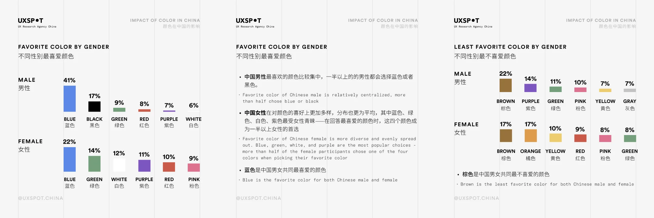
So while some broad gendered leanings emerge—women exhibit greater openness across color families while men prefer "safe" neutrals—there isn't a clear-cut "feminine palette" versus "masculine palette" in play. Preference distributions overlap across many hues.
Marketers hoping to turn gender into an impactful segmentation variable should dig below the surface level. Creative color use can encompass gender perspectives while transcending stereotypes.
Pink
Our interview participants revealed the divisive nature of pink within modern Chinese color psychology. While some perceive pink as lively, cheerful, and energetic—others view it as excessively feminine, vulgar, or even childish, depending on the shade and context.
For one of the participants, a self-described "feminine" woman, pink provoked a strongly adverse reaction: "Only children like pink and tender colors, which is related to their young age and naivety." She said, "Bright colors are more flashy, eye-catching, and can be easily noticed." Yet she associated these attention-grabbing properties with being "unfettered and uneducated."
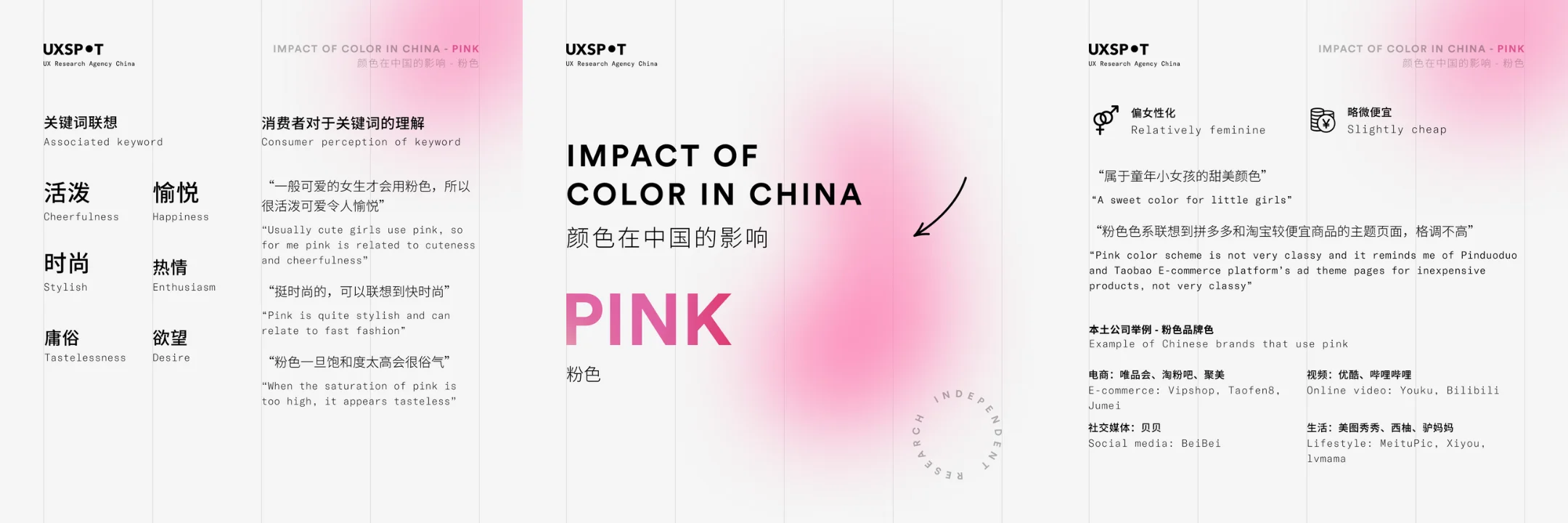
However, another 24-year-old participant opposed the notion that pink is inherently gendered: "Colors should be genderless and can be used by anyone." She viewed the color as versatile enough for a range of brands, comparing it to existing aesthetics used by ecommerce giants: "It looks like the background color of Pingduoduo, the purple shade used by Tmall looks a bit more expensive, and Taobao also uses similar shades."
Quote-wise perspectives centered around three key themes:
Femininity:
Many tied pink's perceived femininity to its popularity among young girls. "Generally, only cute girls wear pink," shared one of the participants. Some even viewed pink as an indicator of female sexual orientation: "If he is a man [wearing pink], he is probably not straight; it is a traditional feminine color."
Cheaper Quality:
Participants primarily associated light pink shades with mass market appeal and affordability over luxury prestige. "It’s not very stylish," according to one of the people we asked, "the powder pink shown here looks cheap."
Vulgarity:
Bolder pinks provoked criticism for being indicative of poor taste. "Once the saturation is too high, it starts looking very tacky."
While versatile applications exist, brands should carefully weigh cultural context when utilizing pinks in China-focused marketing. Muted pink tones may allow non-gendered targeting that avoids childish connotations. However, bolder pink palettes still risk clashing with sophisticated positioning for segments like mature professional women. Consider the audience set the tone.
Red
For centuries, red has stood out as China's quintessential color—associated with luck, joy, passion, and all things auspicious. The hue permeates Chinese cultural festivities today, from red Spring Festival lanterns to red envelopes with monetary gifts. Indeed, traditional color symbolism would suggest red remains beloved by Chinese consumers across generations.
So, does red still reign supreme in the Chinese imagination today? Or has overexposure tinged commercial uses with a cheap tackiness factor for more discerning consumers? Our interviews highlight clashing generational perspectives…
Many still connected red's energetic qualities to cultural traditions. "Red brings excitement. It reminds people of fire and warmth, family reunions, New Year celebrations, weddings, and other traditional ceremonies," stated one of the participants.
Yet our interviews uncover a more complex picture, revealing a generational divide between red's symbolic legacy and perceptions of its overcommercialization in modern daily life.
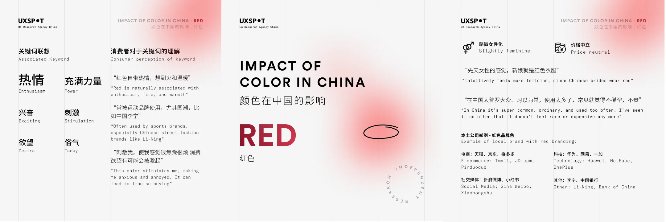
Color red provoked some visceral reactions around cheapness and poor aesthetics: "It is too common and commonplace. It is used too much." Another participant associated red with tackiness, stating: "Things that are popular are often red, but like a fad will pass, like a gust of wind, without quality."
Three perceptual themes emerged:
Passion
Interviewees viewed red as a color stirring excitement, desire, and love. "Passion is red. It is a very suitable color to express love. " Some referenced emotional reactions to red are "angsty" and can make one "irritable."
Power
The color is connected to the intensity and adrenaline for many. "It has something to do with boys from the sports department. It makes me think of sneakers and Li-Ning from China," shared one. Others described red as "full of power," evoking "thrilling" sensations.
Polarizing Taste
While some found red aspirational, many critiqued its ubiquity in China. Cheapness perceptions stemmed from everyday overuse versus luxury prestige. Still, upscale associations were held for some, and one participant mentioned feeling red has a "Hong Kong fashion style" when executed correctly.
Orange
Our color preference survey revealed orange as one of the most unanimously rejected hues across both genders. Yet in interviews, orange perceptions proved more polarized, with some praising its vitality while others critiqued its vulgarity or manipulative bargain aesthetics.
Those with positive orange associations used descriptors like "optimistic," "powerful," and "exciting." One of the participants tied the color orange to natural vitality and bounty, stating: "piles of grain, the feeling of fire, oranges and sweet potatoes, ripe fruits, vitality." Others focused on visual dynamism, "incandescent lights in the pub, flames in the stove.”
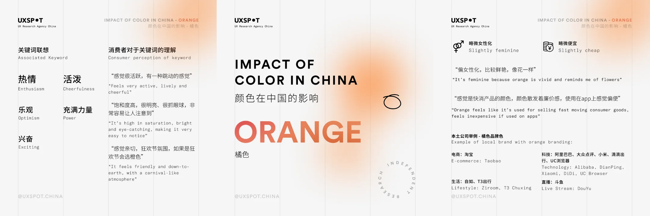
However, negative perceptions around orange's aesthetics and price signaling also emerged. Some tied orange to manipulative bargain marketing campaigns. Others mentioned that the color “reminds of a dim view of building facades outside the window, looks dirty.”
Three key themes stood out:
Vibrancy
Many positively noted orange's attention-grabbing properties and conveyance of energy. "High saturation, very bright and eye-catching, very easy to notice.”
Affordability
Some saw mass market use cases more so than luxury prestige for orange. "It feels like a fast-moving consumer product because the color is terrible," one participant said.
Mixed Design Aesthetics
While some found it lively, others viewed orange as almost too fashion-forward and cheap.
So, while orange holds cheerful cultural associations in China, actual marketplace applications require finesse to avoid cheapness perceptions. Consider elevated textures and restrained use over mass notification orange shades.
Yellow
In Chinese culture, yellow traditionally symbolizes nobility and imperial power stretching back millennia. The legendary Huang Di (Yellow Emperor) founded ancient Chinese civilization, and the yellow dragon represented the emperor himself.
Yet in modern contexts, our interviews reveal yellow often conveys a more folksy, mass-market friendliness—sometimes crossing into perceptions of vulgarity in its brighter shades.
Many positively noted yellow's ability to convey cheerful energy. "Lively: bright, colorful flowers." Optimism and comfort were also cited, with one of the participants sharing associations like "sunflowers, the feeling of sunshine.”
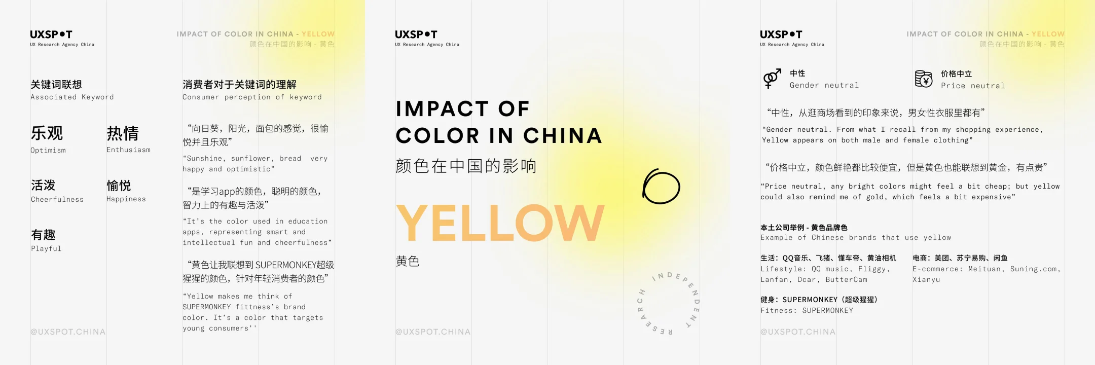
However, certain brighter shades also elicited critiques. “Vulgar, I have never seen a particularly beautiful yellow (the most annoying color),” one of our interviewees said. Others warned yellow can easily become an “uncomfortable” accent that “disturbs” other design elements by its sheer brightness.
We found three key dimensions emerging:
Vibrancy
Many tied yellow to the natural vitality of sunlight, harvests, and flowers. But some felt brighter shades cross into distraction, unable to be the primary color without taking all the attention.
Affordability
Cheapness perceptions were common, given the prevalence of its use in merchandising from shops to street stands. “This color is not suitable for expensive materials and textures,” one of the participants mentioned.
Tackiness
Overly bright yellows were seen as tasteless by some. “It feels vulgar and tacky,” said one, recalling “cheap red and yellow lanterns.”
Our interviews suggest yellow palettes require careful handling in modern Chinese marketing contexts to project liveliness over vulgarity—thinking beyond cultural legacies.
Green
In Chinese culture, green traditionally symbolizes purity and organic wholesomeness. Green labels clean products from “fresh milk” to “organic vegetables” grown without pesticides. It conveys natural harmony and the essence of living things thriving through balanced energies.
Our interviews revealed modern perceptions largely aligned with these peaceful roots. Many positively described green as “comfortable,” “relaxing,” and “pleasant”—invoking the tranquility of forest scenes rich in timber and foliage. “Green plants are very comfortable to the eyes,” shared one participant. Several people referenced protective benefits for eyesight passed down parental wisdom over generations.
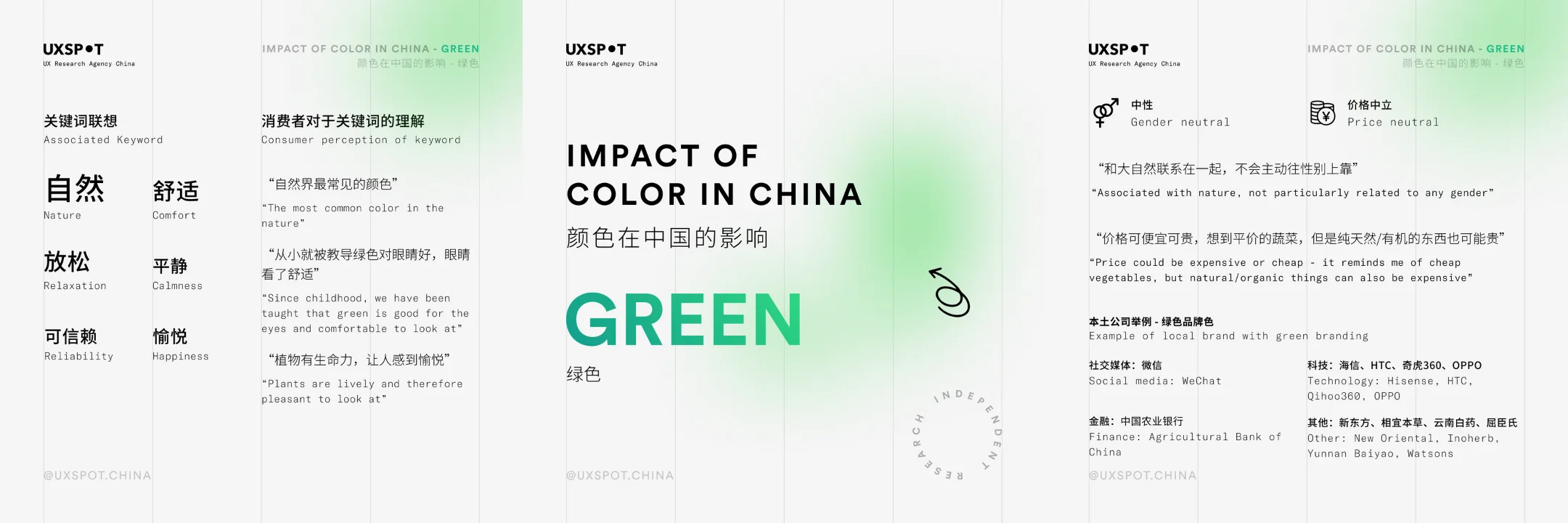
However, some critiqued cheaper produce applications while others viewed overt greens as almost seeming sickly. “When you think of vegetables, they are cheap,” noted one on pricing. Generational and individual preferences diverged between a wholesale embrace of green and more selective adoption.
Three key dimensions emerged around modern reception:
Tranquility
Natural peacefulness and eye comfort were commonly cited upsides.
Affordability
Ubiquitous greenery in agriculture was tied to mass market ubiquity over prestige by some.
Variable Appeal
While some found green perfect as neutral, others critiqued aesthetics or feminine perceptions.
Though culturally tied to harmony and vitality, our interviews suggest that sometimes green risks conveying cheapness or feminine fragility for some modern Chinese consumers. Brands should consider elevated textures and restrained accents over mass bright green shades.
Blue
Our color preference survey found blue as the #1 most popular shade selected by both women and men. Interviews reinforced blue's widespread appeal tied to qualities like relaxation and trustworthiness.
Many tied blue to natural landscapes holding calming properties. "Calm: sea, sky, ink, swimming pool," stated one of the participants on associations. Others explicitly called out destressing abilities, sharing: "I feel very relaxed when I think of the blue ocean."
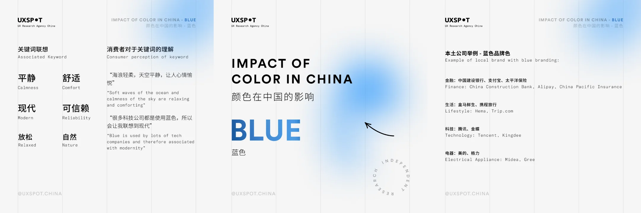
Beyond tranquility, blue also conveyed practicality - seen as affordable in basics yet still sophisticated and trustworthy. "Not particularly expensive because expensive blues have more subtle shades, like Tiffany blue," said one. Modernity perceptions also emerged, with some describing blue as reminding her of "the Internet, digital, cars, and sports,” associating it with such brands as Alipay, WordPress, and Tencent.
Three key dimensions explain blue's broad appeal:
Relaxation
The most commonly cited benefit was destressing coolness reminiscent of breezy skies and gentle waves.
Modernity
Many tied blue to technological progress and forward-thinking innovation.
Trustworthiness
Blue was generally associated with balance, stability, and credibility. From basic staples to elevated sophistication, blue spanned affordable practicality to premium textures.
While universally embraced at moderate intensities, lighter tints risk delicate femininity, and darker shades may lose appeal. Still, blue's crowd-pleasing superpower lies in straddling gender, generational, and economic divides with tranquil neutrality. Brands tapping into that positioning can start from a confident base targeting Chinese consumers in the blue.
Purple
Traditionally tied to Chinese emperors and royalty, purple might seem a natural brand asset through sheer regalia. Yet modern interviews reveal a double-edged sword - embraced more selectively over universally.
Many connected purple to refined elegance and intrigue, especially women. "I feel that women use it more. It gives a sense of mystery," analyzed one male participant. Darker shades conveyed expensive luxury for some, describing purple as "high-end and refined."
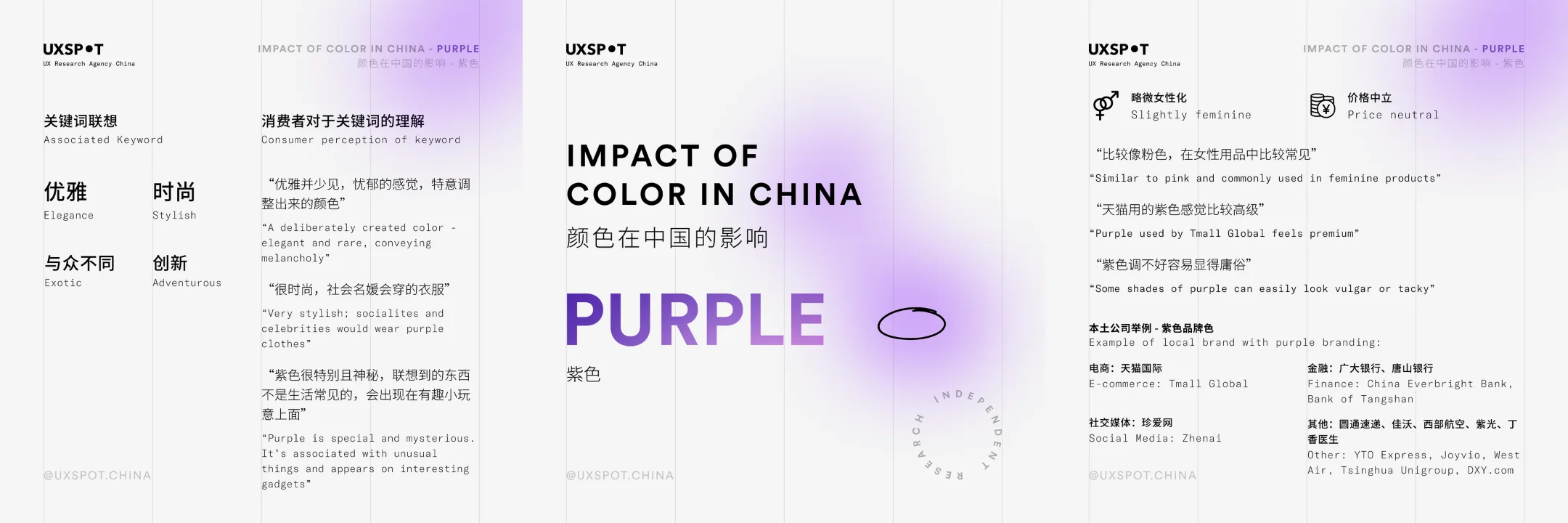
However, risks also emerged around aesthetic subjectivity and potential tackiness. "It is used on many interesting gadgets," said one participant - suggesting quirkiness over sophistication.
Key themes highlight purple's nuances:
Allure
Mystique and elegance made purple alluring for many female consumers and style sophisticates open to experimental colors.
Polarization
Some applauded purple's distinctive flair, while others viewed poorly executed shades as cheap or tacky. Reactions spanned both extremes.
Variable Appeal
Generational divides clearly emerged tied to traditional gender norms, with younger progressive Chinese more open to gender-neutral applications.
So, should brands boldly embrace purple's imperial legacy? Tread carefully. Unlike cross-demographic staples like blue, purple rewards more selective niche targeting, concentrating impact over mass saturation.
Black
Black may seem like an embodiment of luxury sophistication, yet modern Chinese attitudes are more complex. Interviews revealed prestige coexists with drawbacks of coldness and limited versatility depending on context.
Many associated black with elevated refinement in the proper settings, like formalwear and technology. "Expensive, rare obsidian from volcanic sedimentary rocks," remarked one of the participants on luxury perceptions. Others echoed sophisticated applications: "Expensive. You can sell something with this background for several thousand yuan."
However, indifferent and depressing qualities also emerged. "It's a bit depressive,” noted one participant, suggesting too much black risks going too far. Another cautioned black alone "will be powerless" - requiring intentional pairing to build vibrancy.
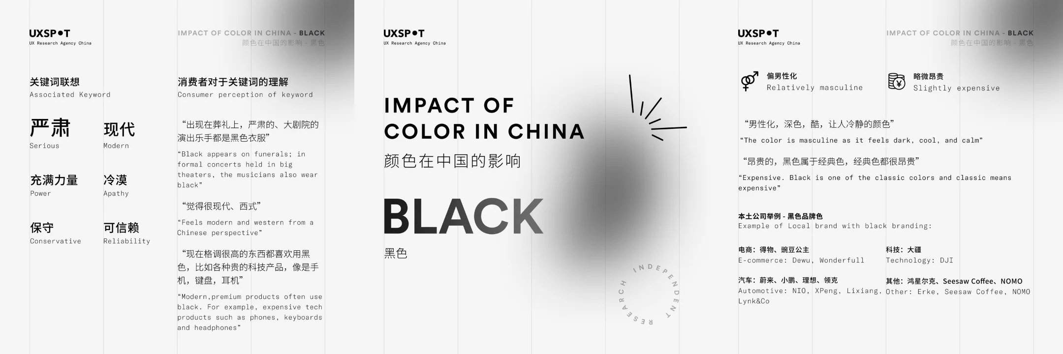
We found three recurring black themes:
Prestige
In high-end categories like fashion and consumer tech, black conveyed singular luxury associations. It is universally seen as a classic “reliable” and powerful color.
Polarizing
Some viewed black as versatile neutral, while others still associated it with death's depressing finality. Reactions diverged.
Selectivity
Black requires strategic combining with other shades to project vibrancy amidst innate somberness.
For Chinese consumers, black excellence shines most through elegant subtraction. Brands should harness black for sophistication in considered accent ways that counterbalance innate heaviness - rather than use pitch black excessively. Nuance matters with this rich shade.
White
In traditional Chinese culture, white is often used at funerals, yet modern attitudes emphasize purity over mourning. Interviews revealed an embrace of white for minimalist elegance - albeit with warnings against boring over-simplicity.
Many positively described white as "elegant" and "high-end," invoking refined applications like wedding gowns - "Elegance: purity.” One participant echoed associating white with luxury subtlety: "If you want high-end, use white."
However, overly stark whites also elicited critiques of coldness and unoriginality. "It doesn't have a great sense of design, which makes it almost look lazy. Doesn’t look like an interesting design," critiqued one participant.

Key themes highlight white dynamics:
Refinement
When well-executed, white minimalism conveyed elegance and luxury associations with space to breathe.
Polarizing
Some viewed white as inviting and pure, while others associated it with vacuous boredom and lazy design. Reactions diverged.
Calmness
Most participants found the color white to be neutral and calming, seeing the color as one that can go with anything.
White retains versatile applicability for Chinese consumers when deliberately combined with contrasting accents. But brands should avoid heavy-handed all-white saturation, instead cultivating negative space around considered tonal pairings.
Gray
In modern China, perceptions of the color gray span from high-end elegance to depressing indifference. Our interviews uncovered an embrace of gray for its refined neutrality, albeit with warnings against boring vacancy.
Many positively described gray as "elegant" and "expensive," invoking applications like luxury cars, technology, and fashion. "Elegance - reminiscent of ballet," shared one participant. Several tied gray to the coveted "space grey" used on high-end devices, conveying prestige through simplicity.
However, overly dull grays also elicited critiques of depressing coldness and characterless design. "Boredom - a feeling of shrinkage, a feeling of aimlessness," critiqued one participant.
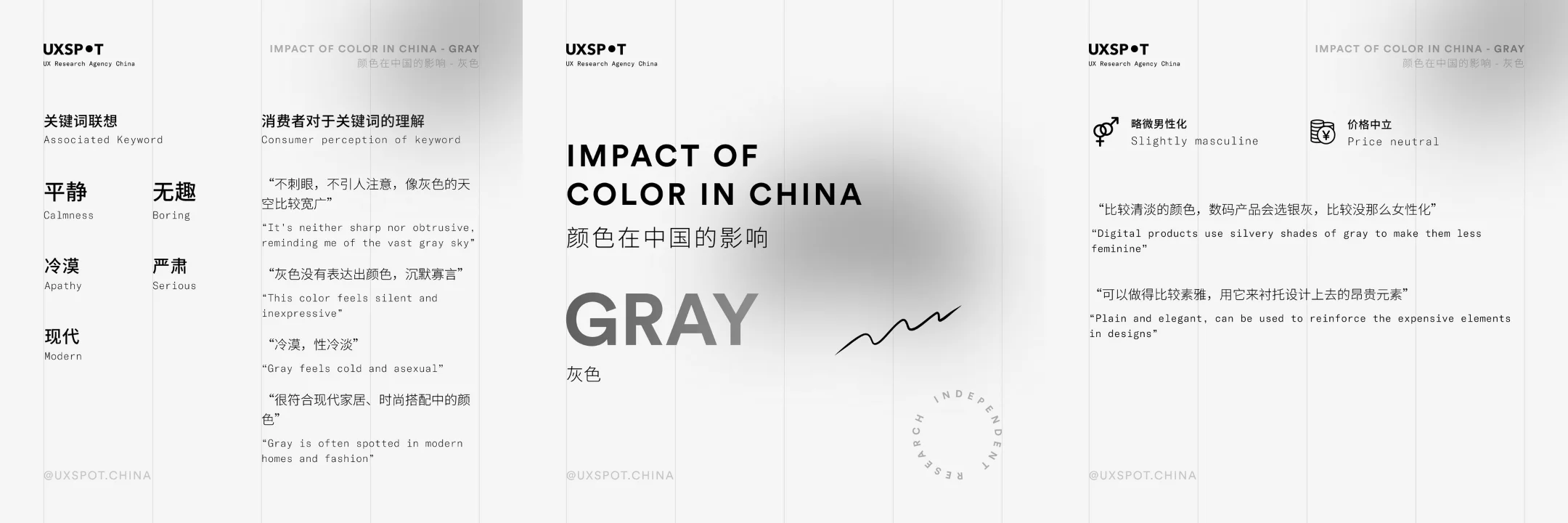
Three key themes highlight grey dynamics:
Refinement
When well-executed, grey minimalism conveyed quiet elegance and luxury associations with room to breathe. "More expensive, a little cheaper than black, more expensive than white."
Masculinity
More than other neutrals, grey skewed masculine in modern Chinese perceptions tied to tech and design aesthetics. "More masculine, less emotional.”
Polarizing
Some viewed grey as cleanly confident, while others associated it with listless depression and hollowness. Reactions diverged. “Pessimism: Thinking of cloudy days, gray areas, things that make people less emotional."
For Chinese consumers today, grey contains multidimensional potential - spanning aspirational subtlety and melancholy gloom. Brands should strategically harness grey’s masculine edge for soft-spoken luxury. But avoid vacant sterility that dims vibrant engagement. When thoughtfully balanced, grey offers impactful sophistication.
A Vibrant Blend of Old and New
For brands seeking authentic connections in modern China, traditional color symbolism provides an invaluable starting point—but fails to capture the multidimensional reality of this vast, evolving market. Our research reveals that a vibrant blend of enduring cultural associations and rapidly emerging modern preferences now shapes how Chinese consumers respond to color across generations.
While red and yellow still read as cheerful and auspicious, their everyday ubiquity also risks cheapness perceptions today. Brighter shades require elevated textures to regain luxury prestige. Yet, at the same time, newer global brands like Tiffany have imbued even primary hues like blue with aspirational modernity. Gender attitudes have also progressed, with young female consumers increasingly embracing versatile palettes from bold oranges to gender-neutral blacks once skewed toward masculinity.
Beyond shifting color associations, aesthetics themselves may diverge across generations. Where once imperial purples conveyed regal class, now they risk youth perceptions of tackiness amidst China’s stark generational divide. And preferences across categories have specialized– sublime whites may uplift wedding gowns while depressing in tech.
The modern Chinese color spectrum proves at once loyally national yet increasingly cosmopolitan. As globalization accelerates, the ancient and the avant-garde blend beautifully to shape local interpretations of international trends. Perceptions remain grounded in cultural traditions even as preferences attune to globalized digital lifestyles.
Brands hoping to make a splash should tap into this fluid fusion—balancing symbolic legacy with sensitivity to China’s manifold diversity across regions, ages, and income levels. Because in today’s kaleidoscopic China, the psychology of color defies simplistic stereotyping. Consumers demand more dimensional authenticity than reductive ads of the past. While research uncovers intriguing market segments, one size rarely fits all in this polymorphic land.
The future remains vibrantly uncertain—and that’s what makes color psychology in modern China so exciting. A little grounded insight paves the path to resonant connection across this journey of a thousand miles.
Have a project in mind?
Join our newsletter!
Get valuable insights on the latest digital trends, strategies, and developments in China and globally delivered straight to your inbox.
